SCOPE : GRAPHIC DESIGN • ART DIRECTION • PRODUCT DESIGN + DEVELOPMENT • MOTION GRAPHICS
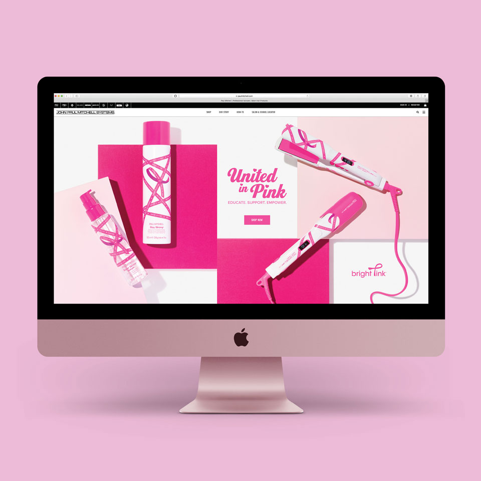
BRIGHT PINK — United in pink. United in purpose.
Each year John Paul Mitchell Systems, Paul Mitchell Schools, and Bright Pink partner to educate, support, and empower women to become advocates for their breast and ovarian health. Since 2014, more than $350,000 has been donated from sales of limited-edition merchandise.
The annual design challenge was to reinterpret the pink ribbon in a fresh, relevant way that inspires stylists and clients to participate, purchase, and give. My approach was selected for its bold reinterpretation of an iconic symbol, with every iteration raising the bar on the last.
DELIVERABLES : PACKAGING + TOOL DESIGN • WEBSITE DESIGN + DIGITAL ASSETS • ANIMATION

REINTERPRETING AN ICONIC SYMBOL
The campaign’s visual anchor is a reimagined pink ribbon — printed in criss-crossing patterns across product packaging, gift bags, flat irons, and brushes. Each ribbon carries a message: United in Love. United in Courage. United in Pink.


DESIGNED TO GIVE
Collaborating with overseas manufacturing partners to produce limited-edition tools and gift sets for retail — making the campaign as beautiful to give as it is to support.